What to Wear for Your Engagement, Family or Wedding Photos

Full disclosure before any of this: I'm a 30-something dad who lives in gym gear more than actual clothes, and the one time I actually planned an outfit for family photos, in Bali, I left the shirt at home and had to go find a replacement in a hurry. So take the following with whatever level of authority that earns me.
"What should we wear" is the question I get asked more than almost anything else, so I figured it was worth writing down properly instead of just repeating myself in emails every week. This isn't styling-course advice. It's just what I've noticed actually holds up in photos after a few hundred families and couples.
Comfort, mostly
If you're tugging at a collar or hiking up a dress the whole shoot, it shows up in the photos. Every time. The people who end up relaxed in their photos are almost always the ones who were comfortable in what they had on.
Beyond that, I tend to judge an outfit by whether you'd still like it in ten or twenty years rather than whether it's on trend right now. I hold the photos themselves to that same standard when I'm editing, so it only makes sense the clothes get the same treatment.
Colour is the other big piece of this, and it's worth its own section, because there's a bit more to it than just "wear neutrals."
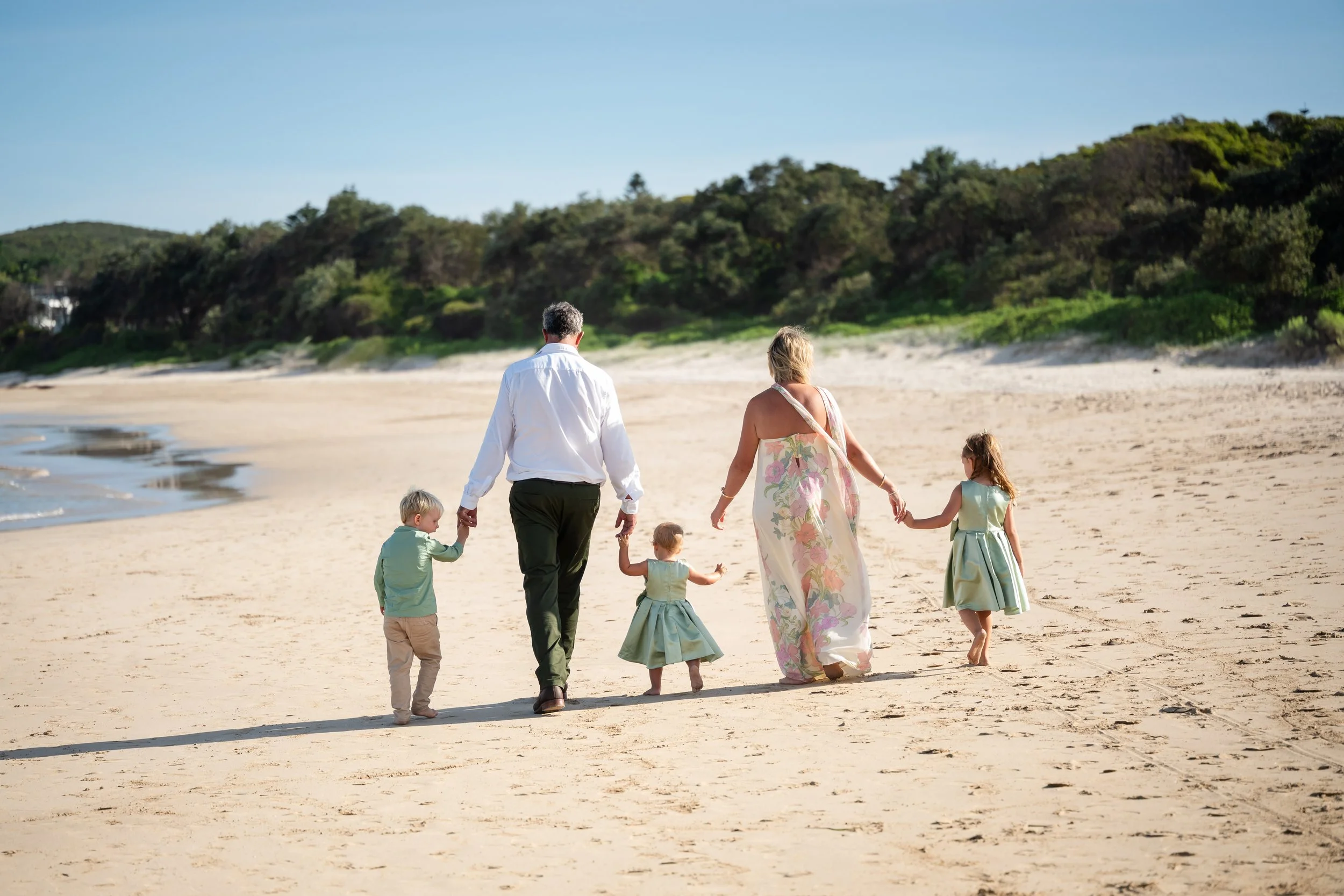
You've already used colour theory, even if no one's called it that
If you've ever helped plan a wedding, you've done this already, whether you realised it or not.
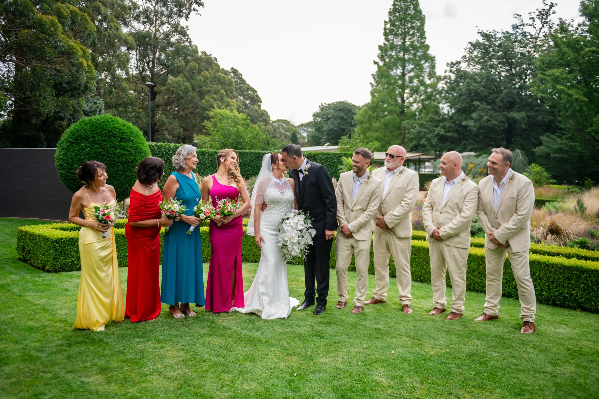
Nobody picks a venue with warm timber and stone, then throws in fluorescent purple flowers, mismatched bridesmaid colours and a table runner that fights everything else in the room. Somewhere along the way, decisions get made so it all sits together: the venue sets the tone, the florals pick up on that, the dresses work with the florals, the suits sit against the dresses, and by the time you get to the table settings, it's all speaking the same language. Nobody at the wedding consciously clocks any of that. They just notice that the day looked like it belonged together.
That's colour theory. You don't need the art-school version of it to use it well in your photos either.
The two things worth knowing
There are really only two moves.
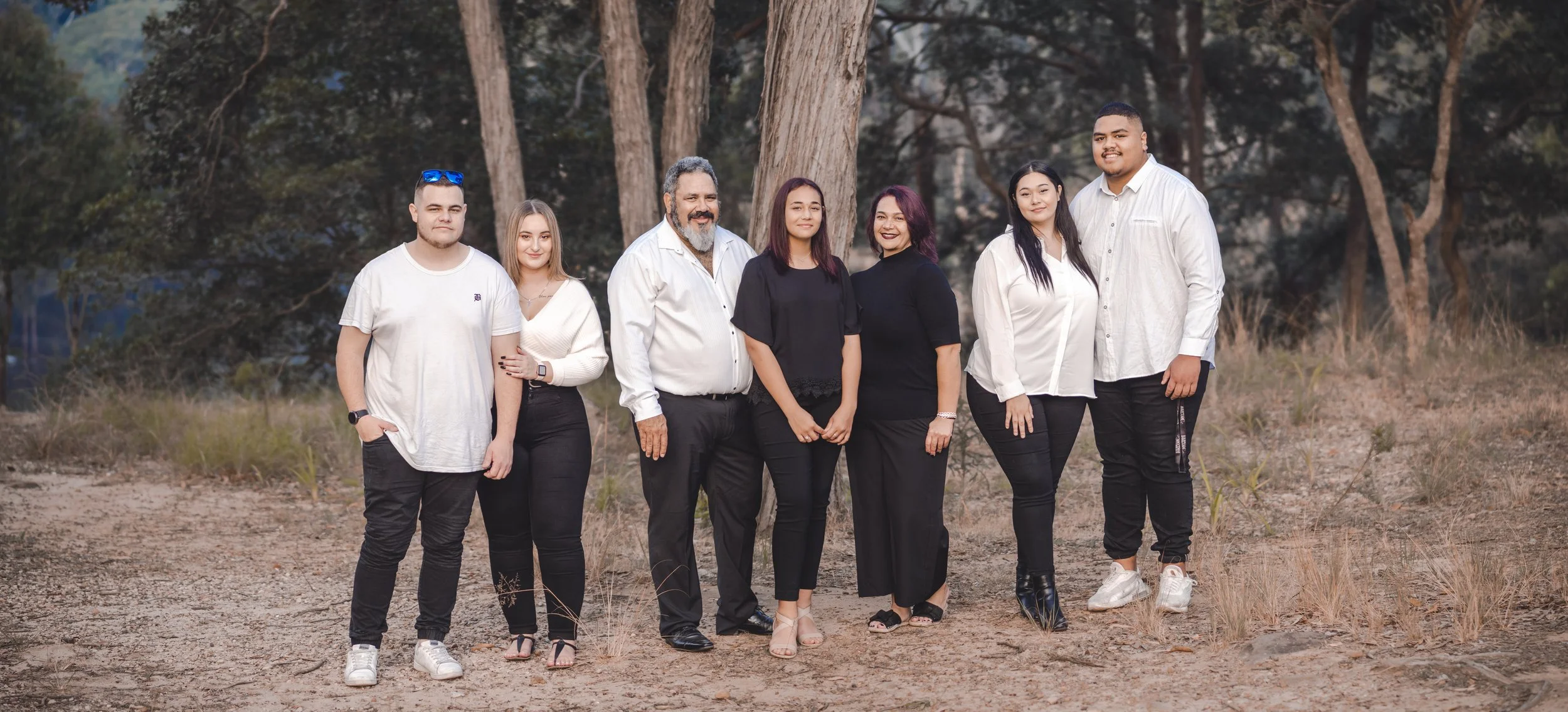
Colours that sit close together on a colour wheel, properly called analogous colours, blend. Think cream, tan and soft olive, or navy, denim and dusty blue. Put a family in a loose mix of those and nothing fights, nothing stands out for the wrong reason, and the group reads as one connected unit rather than four separate outfits that happened to end up in the same photo.
Colours that sit opposite each other, the actual complementary pairs, despite what a lot of styling blogs call them, create contrast instead. Navy and rust. Teal and mustard. Deep green and dusty pink. Used well, these make a photo feel like it's got some life in it rather than fading into the background.
For most family and couple sessions, I lean analogous. It photographs softer, it's more forgiving, and it tends to still look right in ten years rather than dating to a particular season of Pinterest.

Jumping out of neutral, on purpose
Neutral is a safe place to start if you're not sure. It isn't the only option, and it shouldn't be the automatic one either.
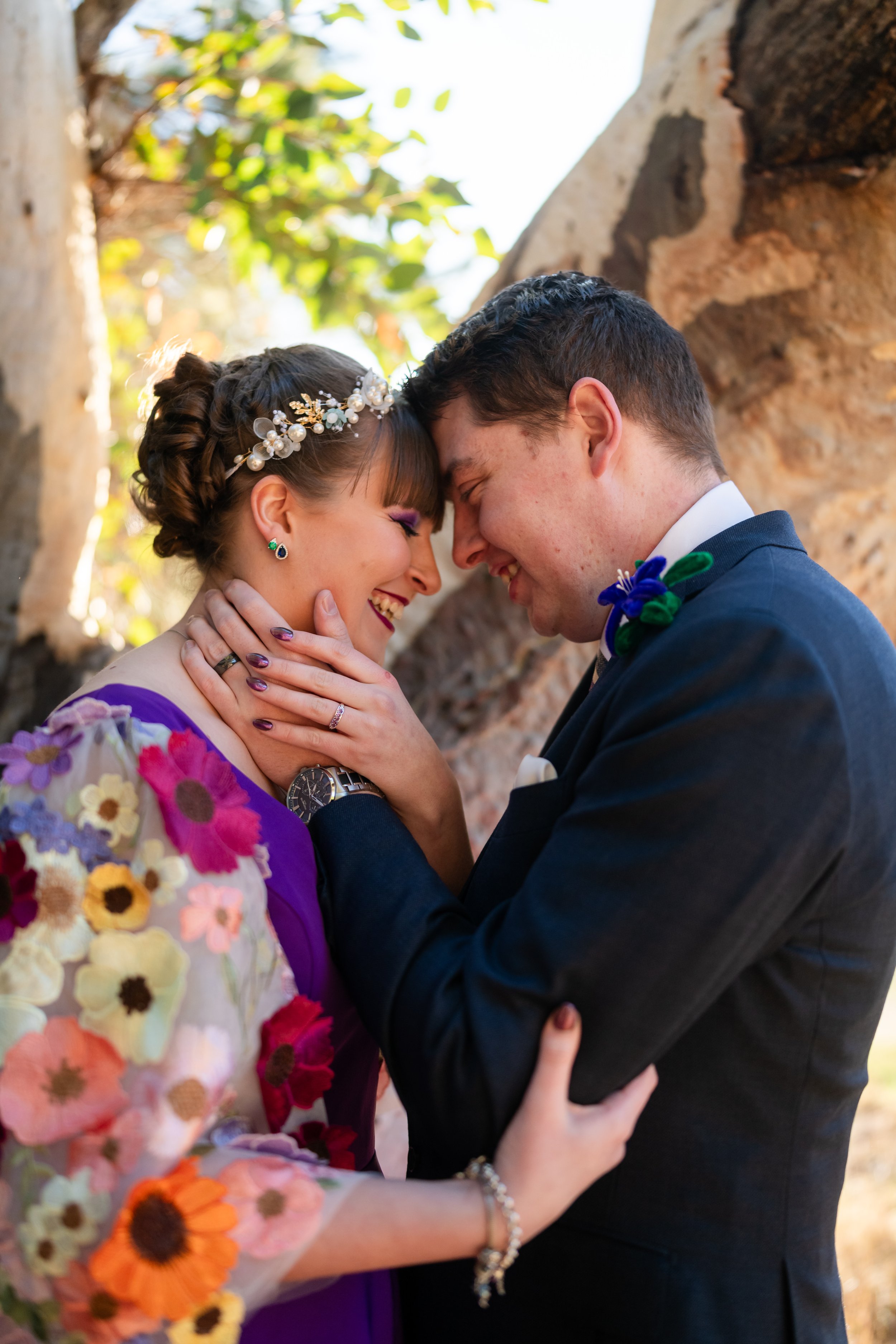
If there's a colour that's actually you, a rust dress, a deep teal shirt, a mustard jumper, the trick isn't avoiding it. It's being deliberate about where it sits. One person in a genuinely bold colour against a family otherwise dressed in warm neutrals reads as intentional. Four people each in a different bright colour reads as chaos, because everyone's outfit is competing for the same attention at once.
Same goes for a couple. If one of you wants to wear the colour you actually love instead of playing it safe, do it. Just let the other person sit a little more neutral so the contrast has somewhere to land instead of turning into a shouting match.

Let the location do some of the work
Your venue already shapes your wedding's palette, so it makes sense your photo location should shape your outfits too.
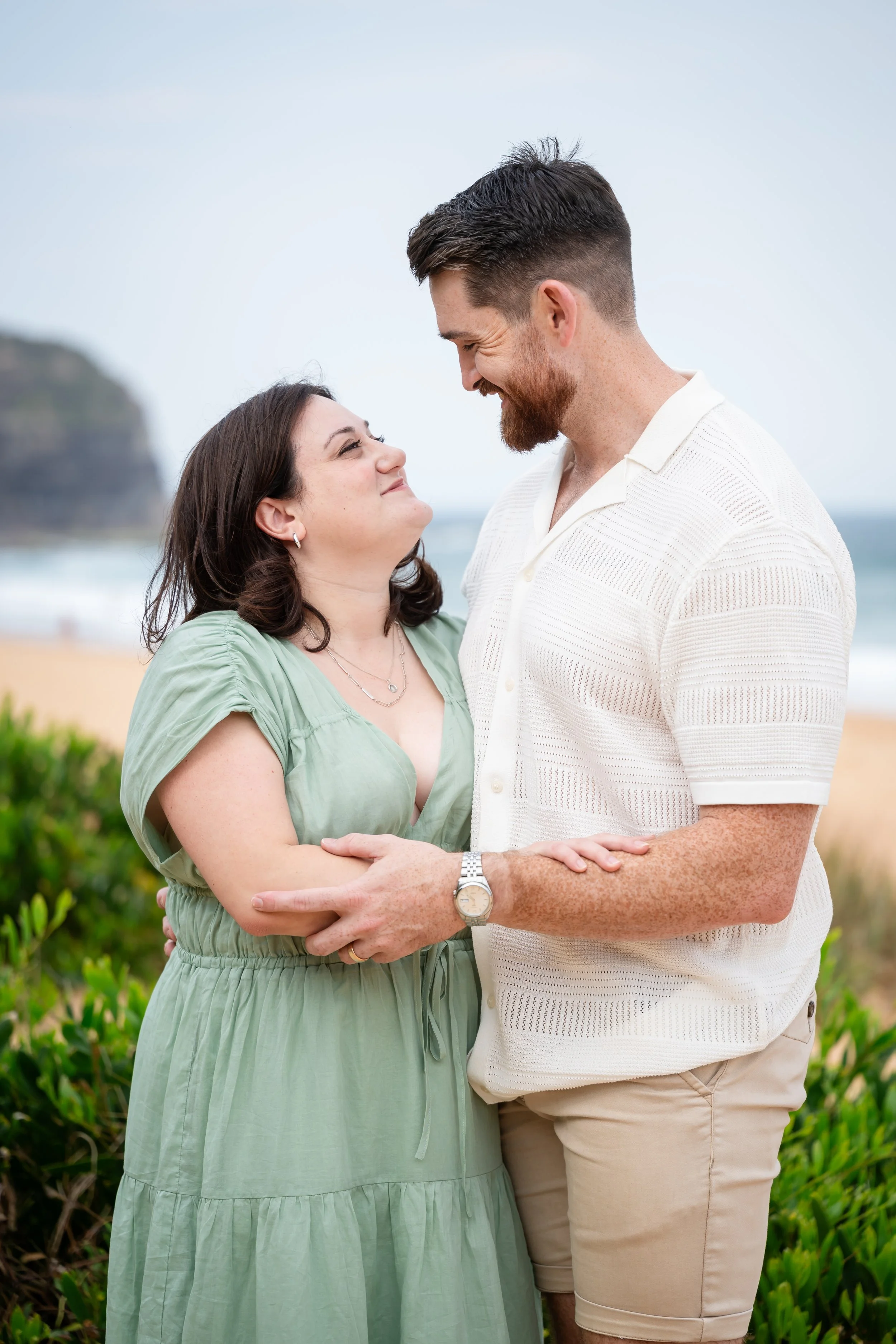
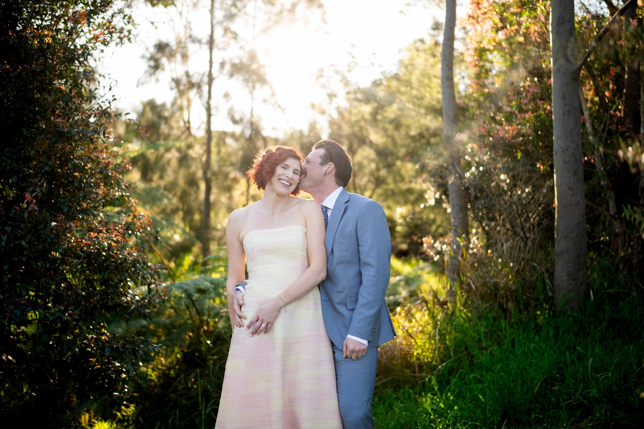
Somewhere leafy and green, out in the Blue Mountains or up in the Hunter Valley, already carries greens, browns and warm neutrals in the background. Creams, olives, rusts and tans sit naturally inside that rather than fighting it. A beach session calls for the opposite lean: soft blues, sandy neutrals and faded denim. Somewhere more urban, concrete and brick, can actually carry richer colours than people expect, charcoal, forest green, a deep burgundy, because the backdrop has enough weight to hold them.
None of this is a rulebook. It's the same thing that happens at a well-styled wedding: the venue, the florals, the dresses and the suits aren't competing with each other, they're each doing their part. Your photos work the same way.
Engagement shoots
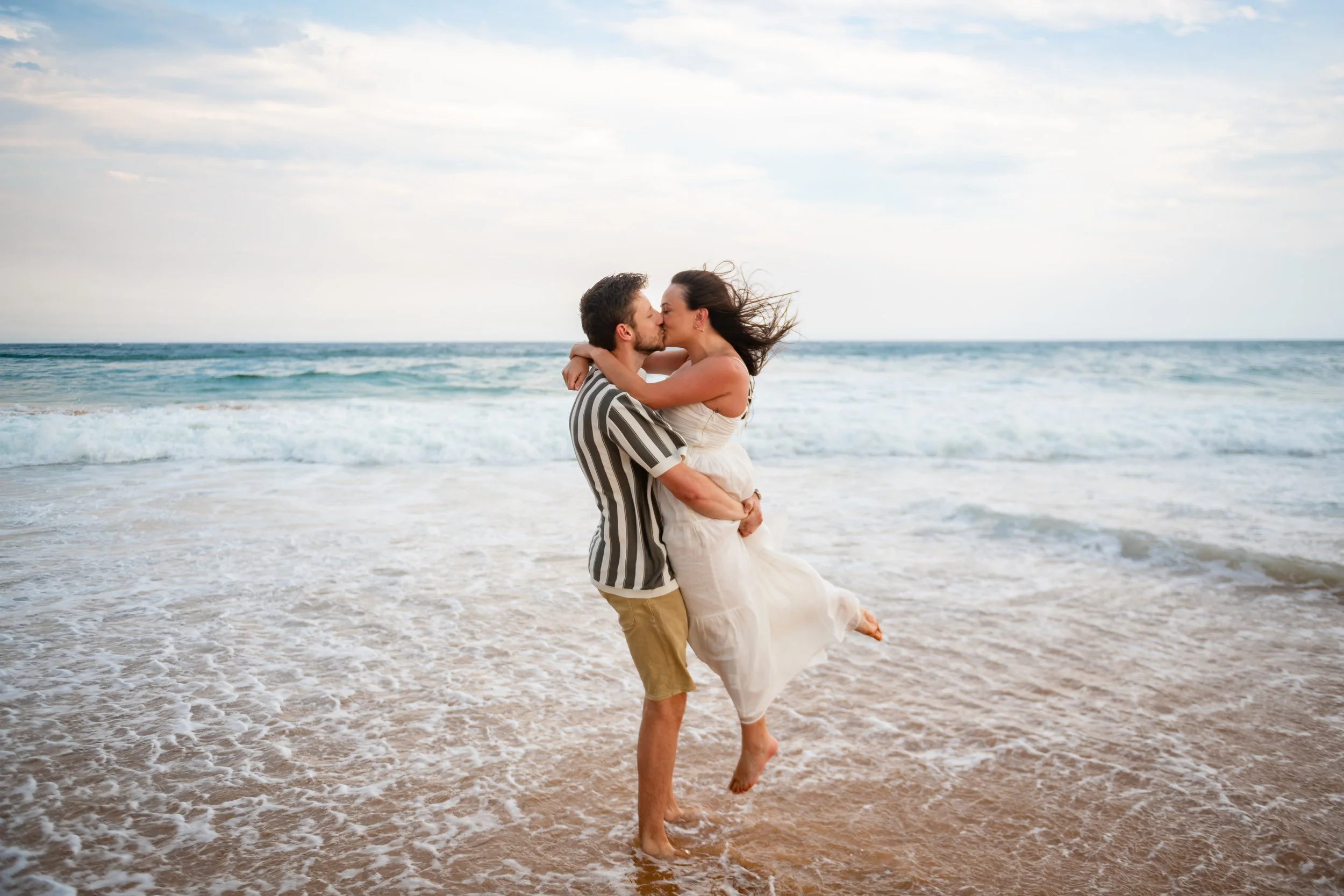
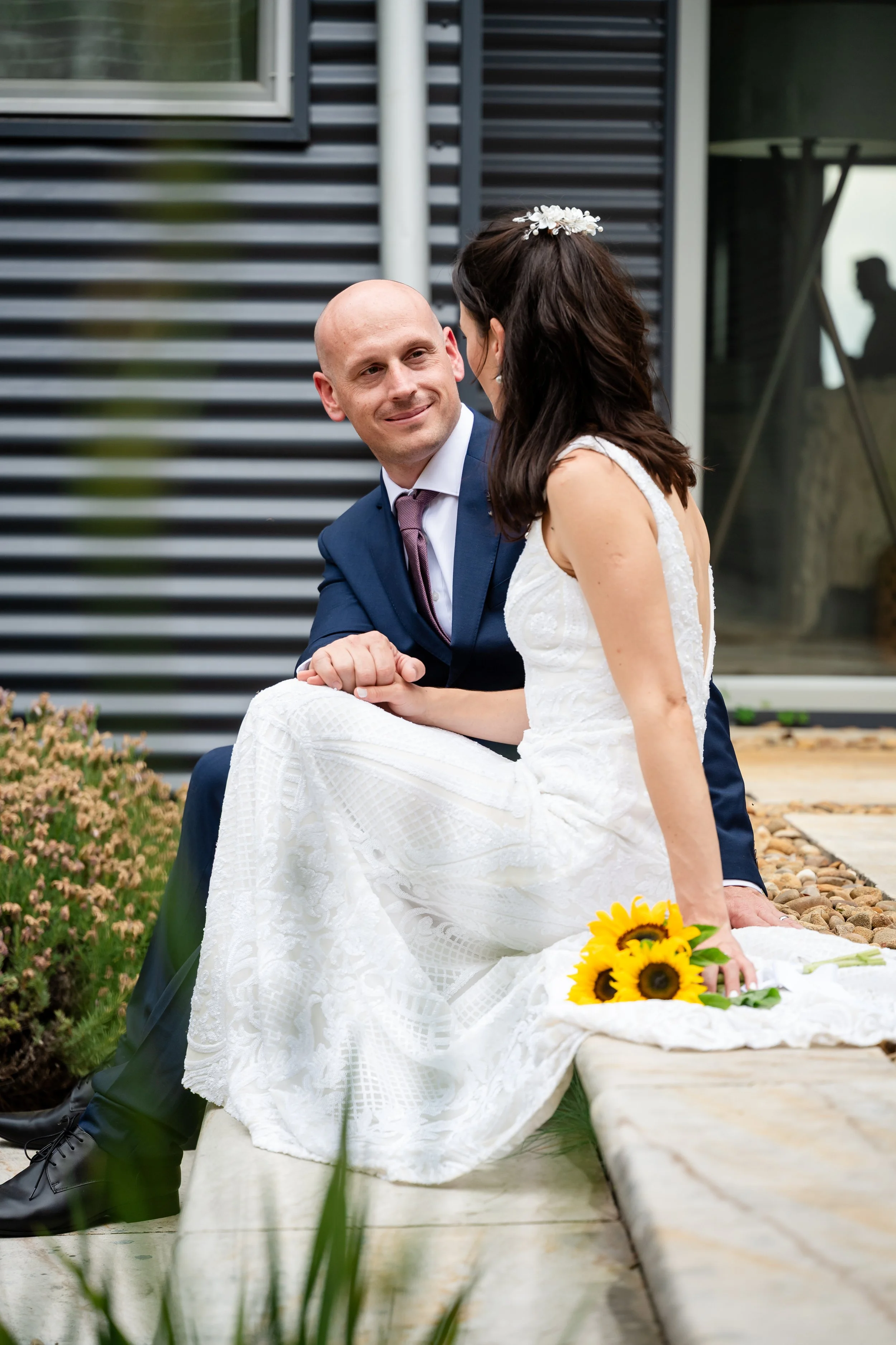
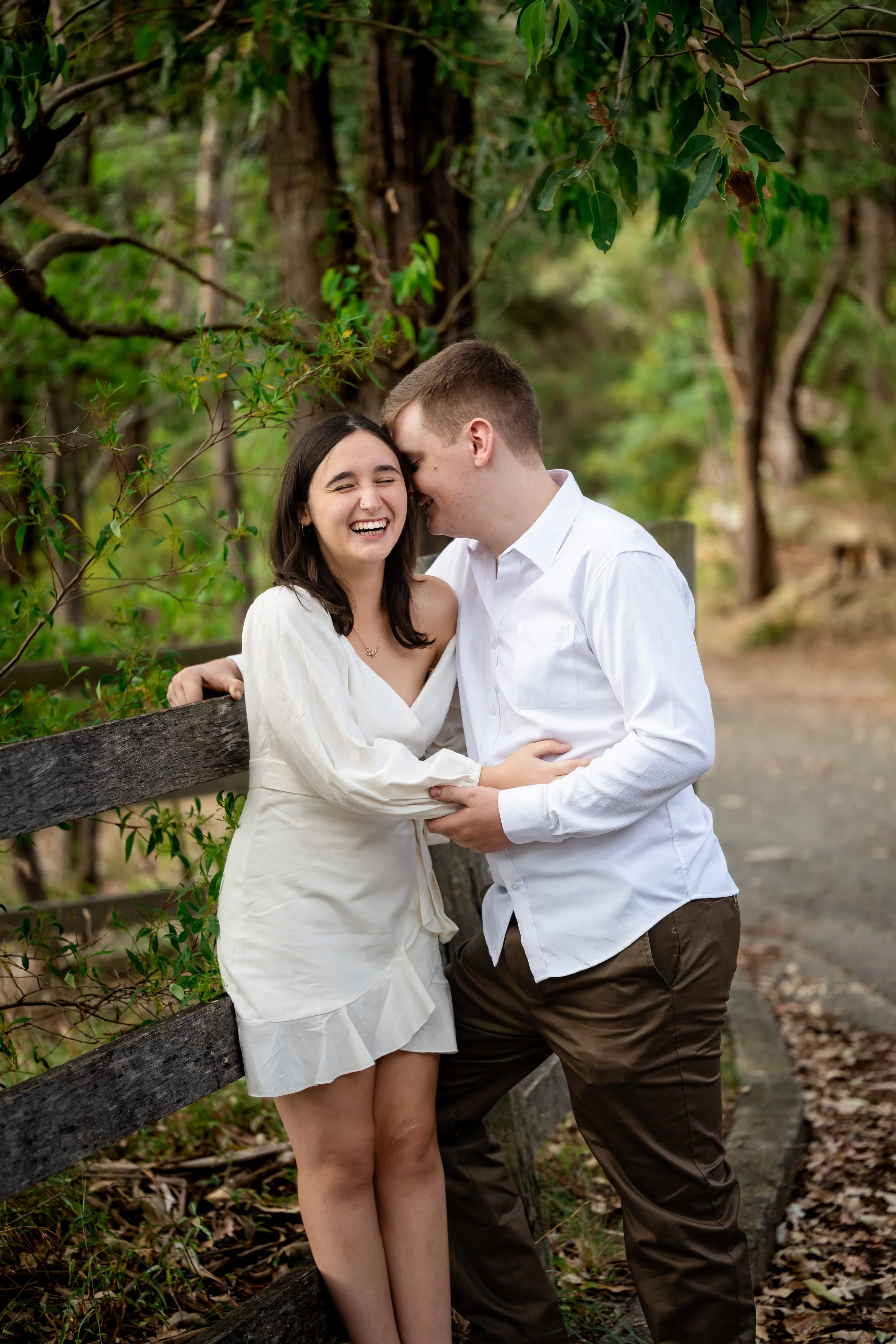
Coordinate loosely instead of matching outfits exactly, an analogous palette works especially well here. A bit of contrast between the two of you usually reads better than identical tones head to toe.
Dress up a notch from your everyday, but stay in something you can actually walk and sit and laugh in. If we're shooting somewhere with a strong personality, a beach, a vineyard, a laneway, let that guide your colours rather than working against it.
If you've got a hair and makeup trial booked before the wedding, an engagement shoot is a good excuse to use it early. You get to see it in photos before it actually counts.
Family shoots
Same idea. Loosely coordinated tones rather than matching, comfortable fabrics and shoes people can actually walk in — I've watched enough people wince their way across a park in new shoes to know this one matters more than it sounds. Skip the big logos and busy prints, mainly because they pull focus away from the actual people in the photo.
Kids

Our approach with kids is pretty simple: let them be themselves. If that means running laps of the park or having a full meltdown halfway through, we just keep shooting through it. So the honest answer to "what should the kids wear" is usually whatever you can actually get them into that morning.
If you happen to have a cooperative one, keep it simple and comfortable, and dress for the actual weather rather than how it'll look in a few years' time.
Your wedding day
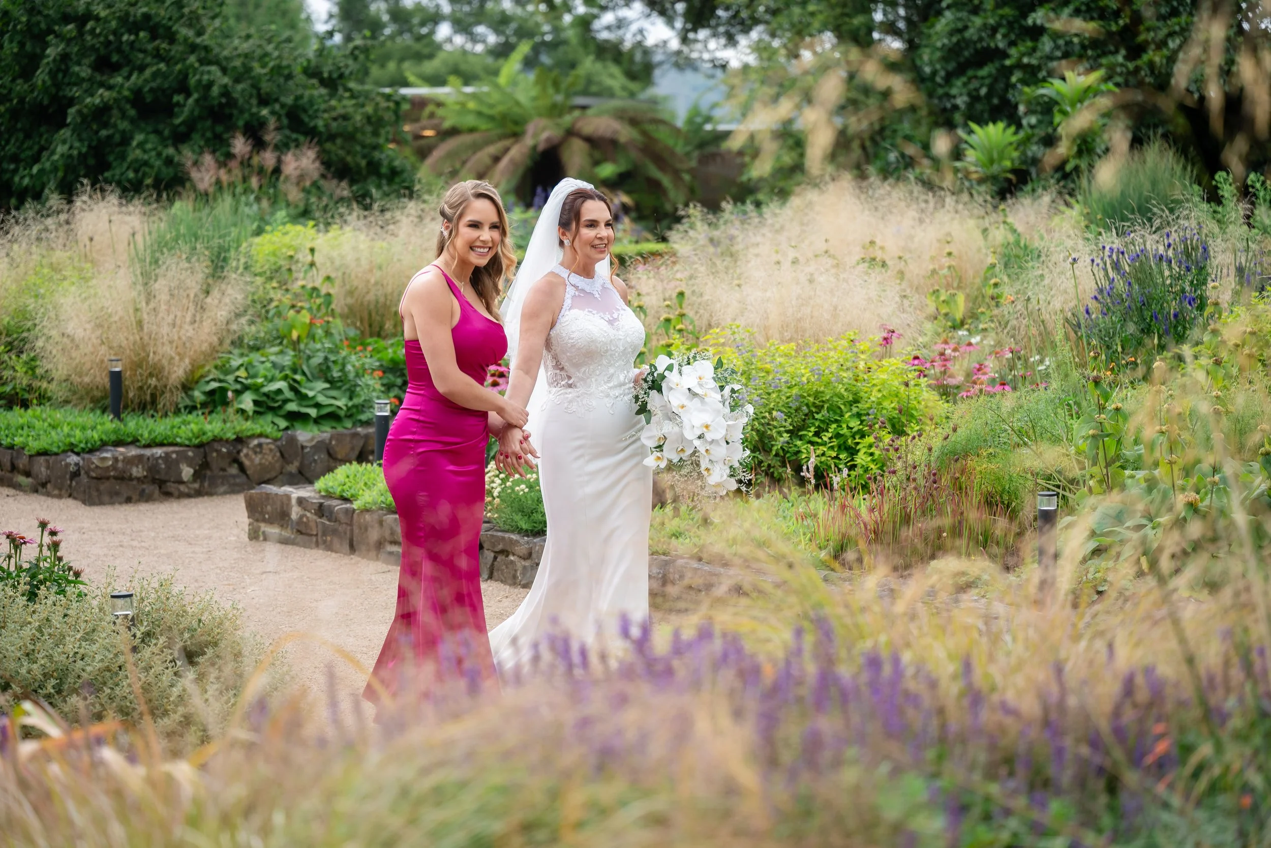
This is less about one outfit and more about the whole day holding up. You've actually already done the colour exercise once, when you picked a palette for your venue and florals. Your bridal party's outfits are the same thinking applied one level down.
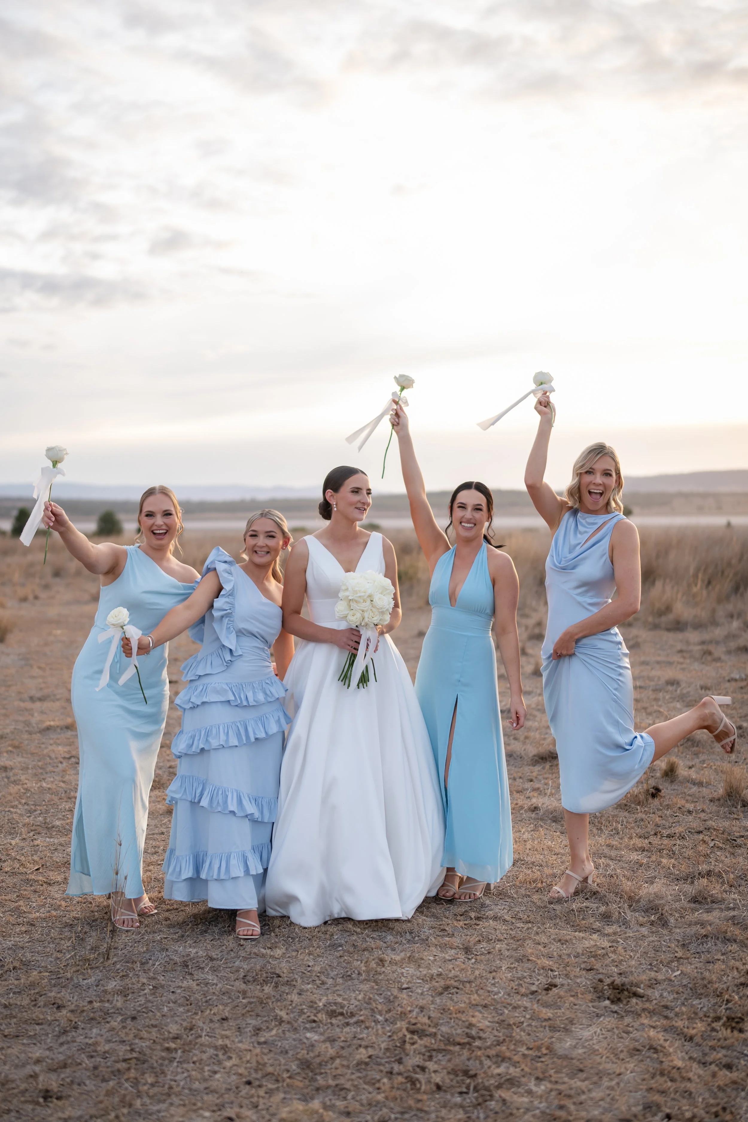
Your bridal party doesn't need matching outfits down to the shoe. Loosely coordinated tones photograph better anyway, and everyone gets to look a bit more like themselves instead of a uniform.
Weather's worth planning for properly, especially somewhere like the Hunter Valley or the Blue Mountains, where the temperature can swing a good ten degrees between the ceremony and the dance floor. A layer you can add or take off matters more than picking one outfit for the whole day.
And if you're doing a second outfit for the reception, which more people are these days, the same rule applies as everything else here: pick something you can actually dance in, not just something that photographs well standing still at 4pm.
Anyway
None of this is complicated. Wear what feels like you, wear something you can move in, and if you're genuinely not sure, ask whoever's doing your hair and makeup or your photographer. We've usually seen what works more times than you'd think.
If you want to talk it through before your own shoot, get in touch and we'll sort it out together.





Once you've got the outfit sorted, the rest is easy. Let's talk about the shoot itself. Check Availability